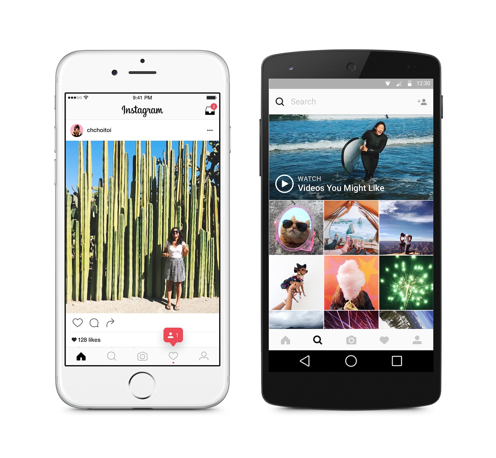
Instagram introduced a new fresher look, including an updated icon and app design for the main Instagram app, and a new unified set of icons for its other creative apps Layout, Boomerang and Hyperlapse. Instagram has also refreshed the user interface with a simpler, more consistent design that helps people’s photos and videos shine. The less crowded the background is, the more attention your photos will get!
When Instagram started, it was a primarily a place to edit and share photos. Five years later, it’s a global community of interests where people share photos and videos, use new tools and connect with others. They have been inspired by all the ways the community has grown and changed, and wanted to create something that reflects how vibrant and diverse storytelling on Instagram has become.
What’s been changed:
Inspired by the previous app icon, the new simplified shape represents a more versatile camera, and the rainbow lives on in gradient form.
Now there is a unified logo set across the family of apps.
The new simpler design of the user interface puts more focus on your photos and videos without changing how you use the app. Developers also made tweaks to icons and fonts so that user’s experience feels more native on Android and iOS.

Instagram designed this look to reflect the community’s full range of expression – past, present, and future. So, the community will likely see this look as a new creative spark.


